This project aims to optimize the landing page experience for business users ( Contractors, Interior Designers, and more) and enhancing their understanding of special benefits offered by Wayfair Professional for their industry, and thereby increasing program enrollments.
Product Design Lead:
UX Research
Prototyping
User Testing
UI Design
Competitor Analysis
Workshop Facilitation
1 Product Manager
1 Engineering Lead
1 Marketing Manager
1 Content Designer
1 Product Design Lead
3 Full Stack Engineers
2 Backend Engineers
July 2023-Dec 2023
+11% Enrollments
+10% Application Completion
A free membership program offered by Wayfair that provides businesses and professionals with access to a range of benefits tailored to their specific industry like Interior Design, Real Estate, Construction, Hospitality, Education and more.
Some of the benefits include exclusive discounts, design services, fast shipping, commercial grade products, easy returns and more.
The Purpose:
To be the destination for all things FURNITURE, FIXTURE & EQUIPMENT for every business.
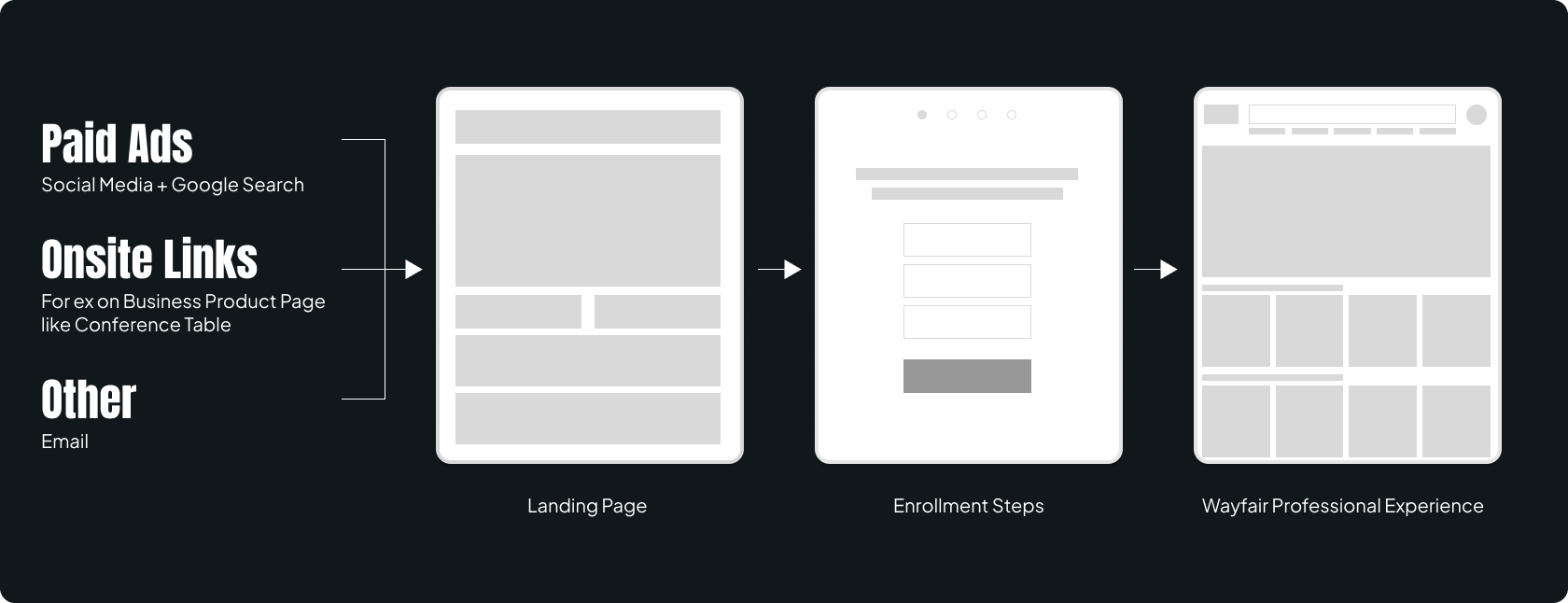
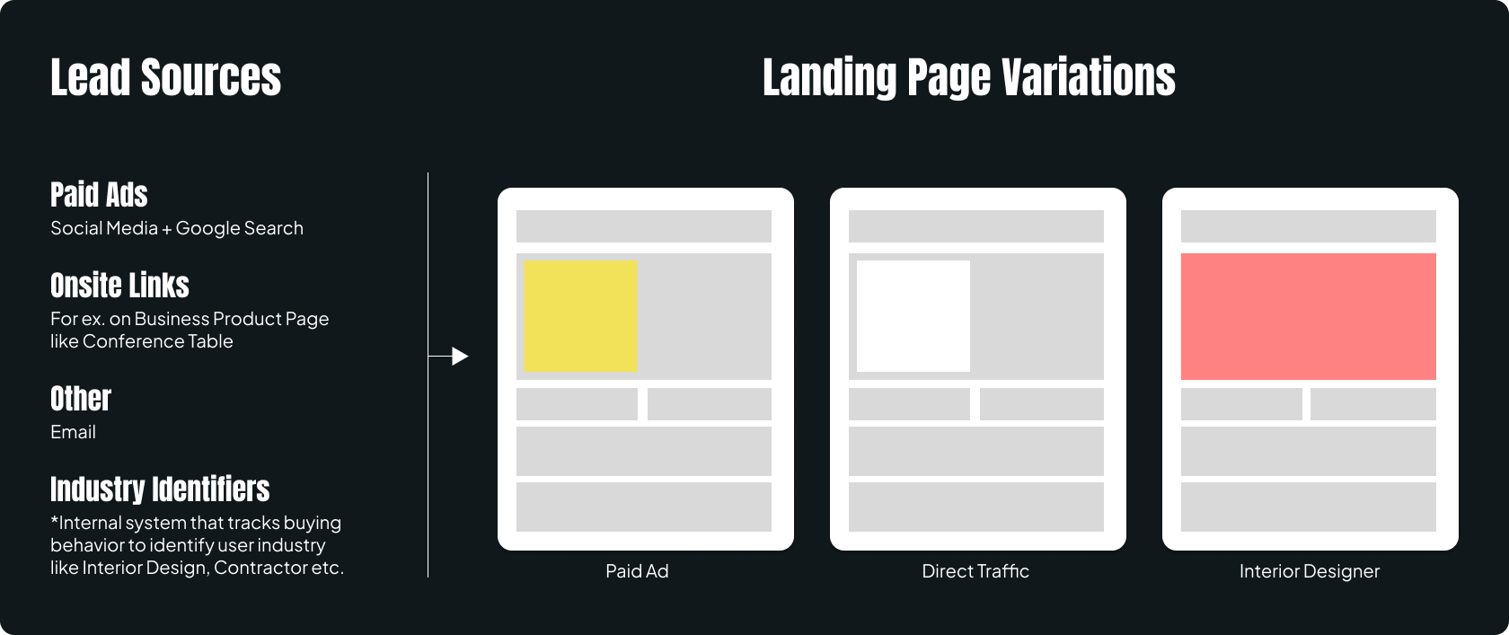
All potential business customers from different sources like Paid Ads, Social Media Platforms, Lead Links from B2C site are directed to the Wayfair Professional Landing Page to help learn what the program has to offer for their business needs and enable them to enroll into the program.
Wayfair Professional takes about 2% of the overall Furniture & Fixture market share for B2B in the US. We wanted to improve this by reaching to more potential business users and educate them about the benefits and services and enroll them into the program.
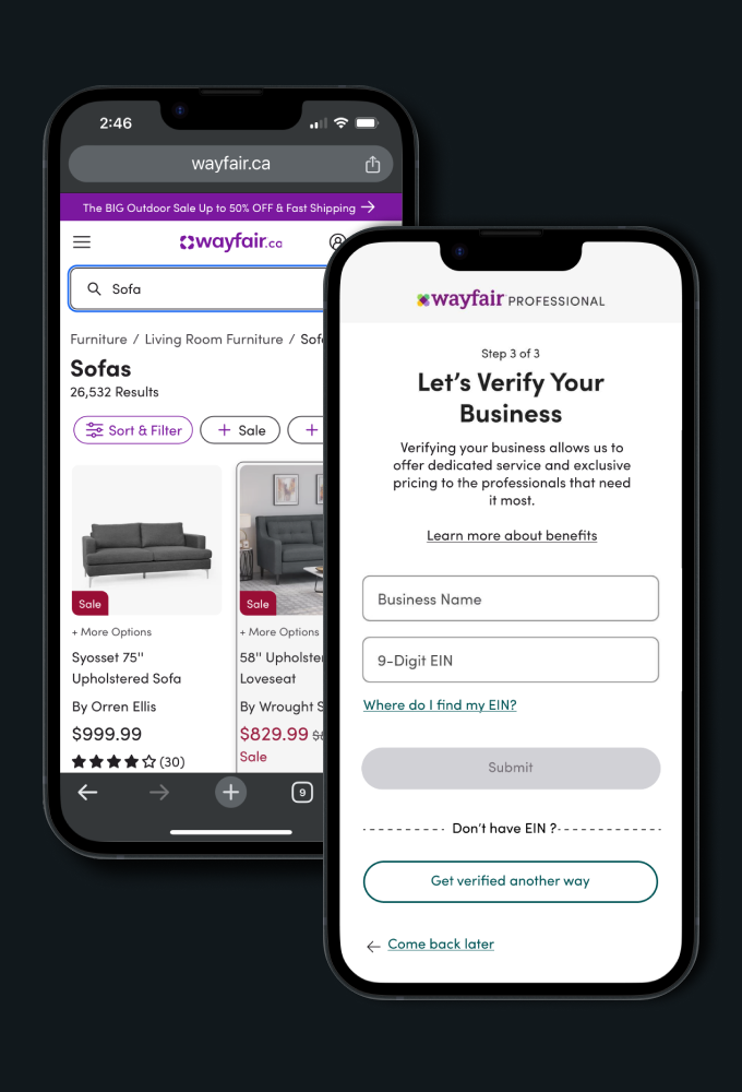
We studied the existing user flow at the start of the funnel and observed that among the users who initiated the enrollment for the business program, about 85% of them dropped at the business verification step.
We needed to improve this and hypothesized that a lot of these users that drop are NOT business users and we needed to do a better job of helping business users to enroll.
Also, we were building additional services like 'Bulk Price', 'Consolidated Delivery' and more, for the business users that needed to be communicated to the user. It made sense for us to consider the user journey and identify opportunity areas on the landing page and enrollment experience for business users.
NOTE:
This case study focusses on the Landing Page Experience only. The improvement of the enrollment experience is a separate project.
OBJECTIVE
I conducted a usability test (on Usertesting.com) based on the existing user journey focusing on the landing page experience with 10 users each for mobile and desktop users to understand:
Based on the usability test and our internal audit, we highlighted the following issues:
Users are enticed about Pro Price but unclear about expected discount value for businesses.
Experience is not tailored to the needs of the leads coming from different sources or industries.
This diminishes the all-in-value proposition for the program as users do not know other benefits.
Users tend not to scroll or engage before starting to enroll and end up with lack of information about the program.
Each lead source (Social Media, Product Page etc.) has a custom built user flow increasing overall maintenance cost.
Information provided is high-level and not presented in an engaging way (Videos/Stats).
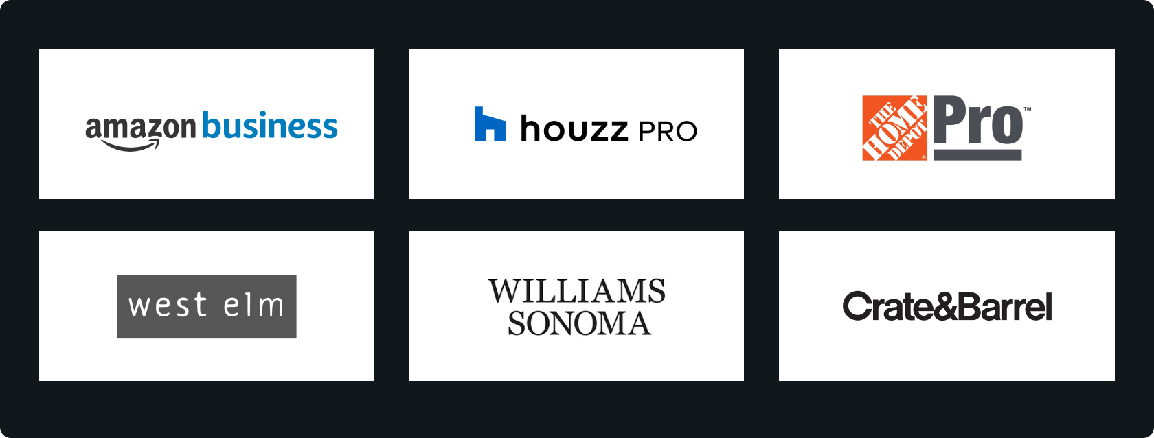
We studied and analyzed some competitors on how they communicate the benefits for business users. The business program is generally referred as 'Trade', 'Professional' (Pro), or simply 'Business' Program. Some of the key take aways from the Business Page from these competitors are given below:
Value propositions and statistics are specific to the industry like Interior Design or Contractors.
Use of videos to share in details on how the program benefits business users is common.
Showcasing benefits in numbers helps quickly understand the value of the program.
We worked with the Business and Marketing team to envision a new landing page to addresses the above issues and that it marks Wayfair Professional as one stop solution for all business needs.
We wanted the new page to have a simplistic code base to minimize the maintenance cost for teams which also allows the business team to test minimal changes like copy for the hero section, CTA copy, without the need for developers (Back end or Front end). The Platforms team was building a new internal system called 'Block Builder' which would allow for such changes.
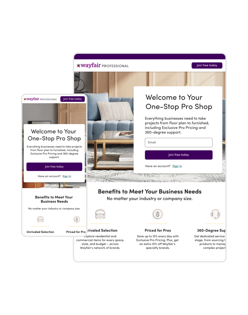
As the design lead, my core concerns were to make the experience seamless and relevant for users coming from different sources or industries. Here is how we envisioned the new Landing Page experience:
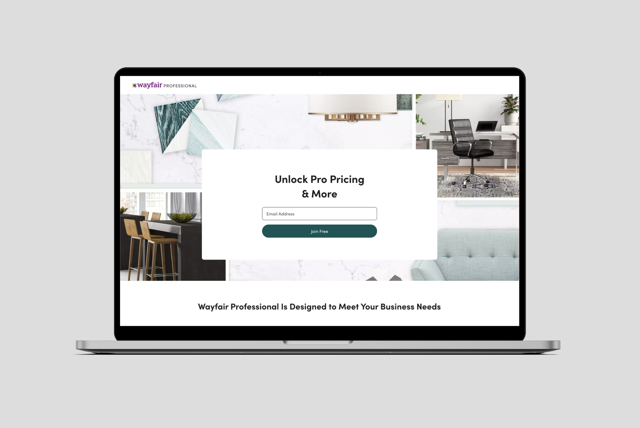
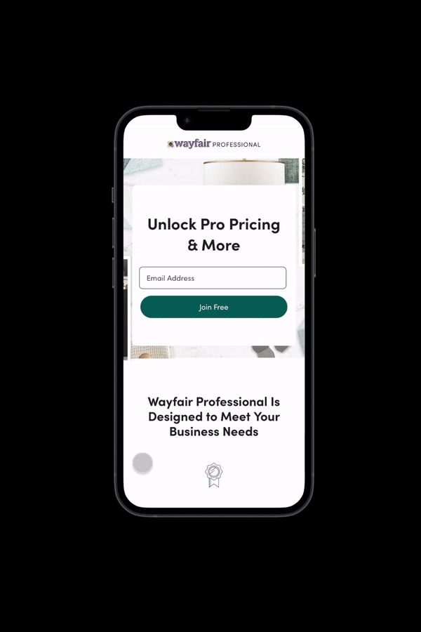
Dynamic Landing Page is a single entry point into enrollment that takes into consideration certain variables such as lead source, customer segment (ex: Interior Design, Contractor) and creates a more relevant landing page experience to help drive and maximize customer acquisition.
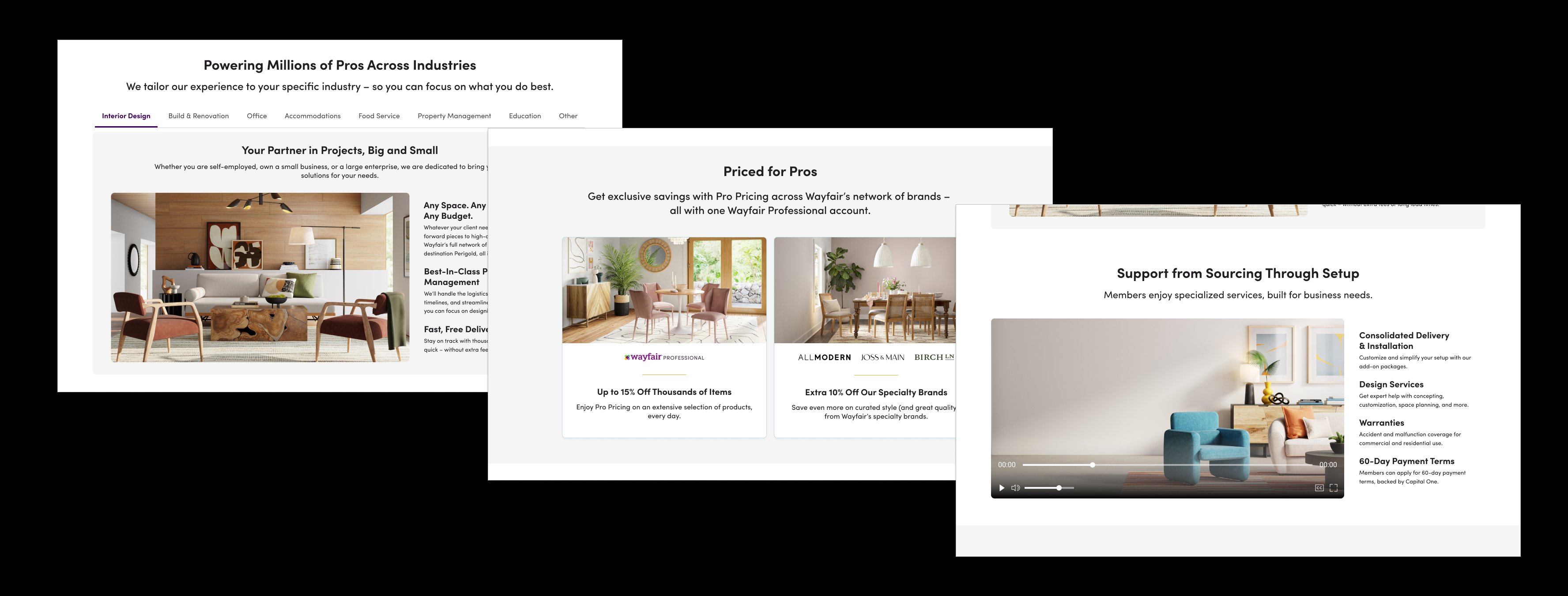
Wayfair Professional offers specific benefits for each industry for example, tax benefits for Educators etc. In addition, update the offers with new services like 'Bulk Pricing' & 'Consolidated Delivery'.
Set the right expectations by clarifying the discount percentage for Pro users.
By making it apparent that the program is for registered businesses will help non-business users to not continue to enroll as it will require business verification. This would address the earlier hypothesis that a lot of non-business users are enticed to enroll to get the Pro discounts.
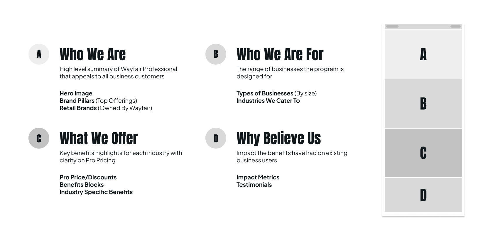
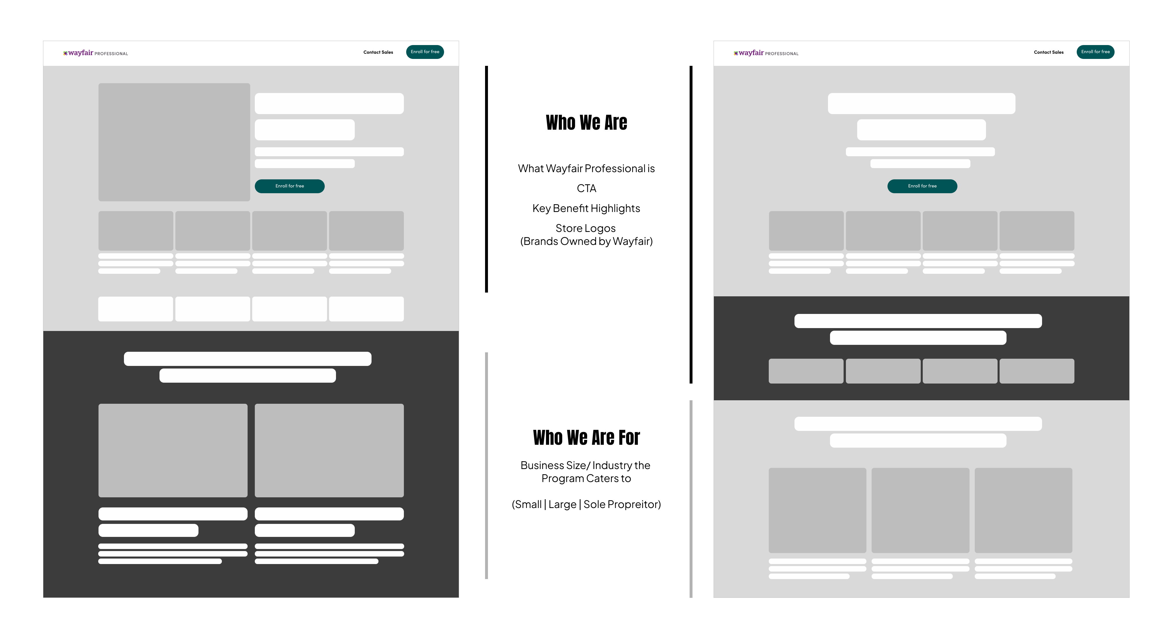
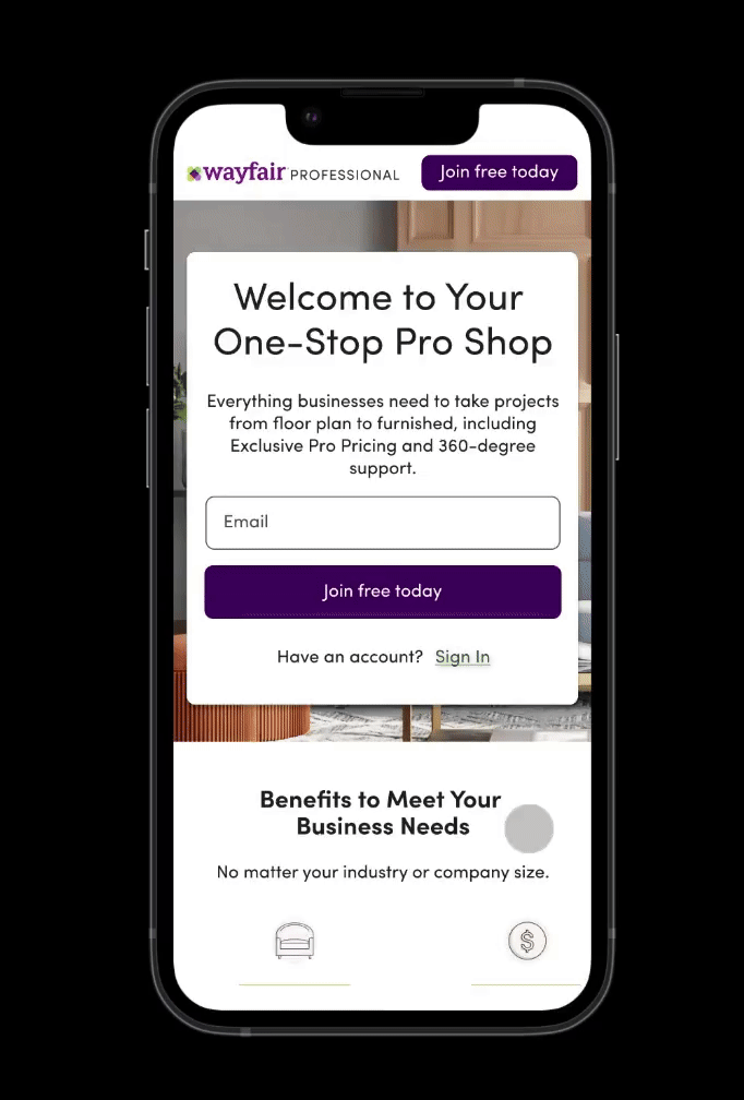
I started with the core structure of the page for positioning the right content at the right places for right engagement with the potential business users. Business users should understand the program and benefits with ease and be able to easily enroll onto the program. Here is how the content was structured:
I iterated on how each section may look like considering the information to be shared on each. Wayfair already had a design system ( called 'Homebase') available and I used the available components to design the page.
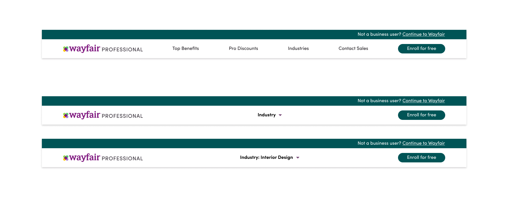
The key for us was to allow business users to understand the benefits Wayfair Professional provides specific to their industry and that all their needs are taken care of when they enroll onto the program. The header iterations explore how the user could switch to the content of their interest and have quick access to the information they might need. For example, select their industry from the dropdown to learn what perks are offered for their industry.
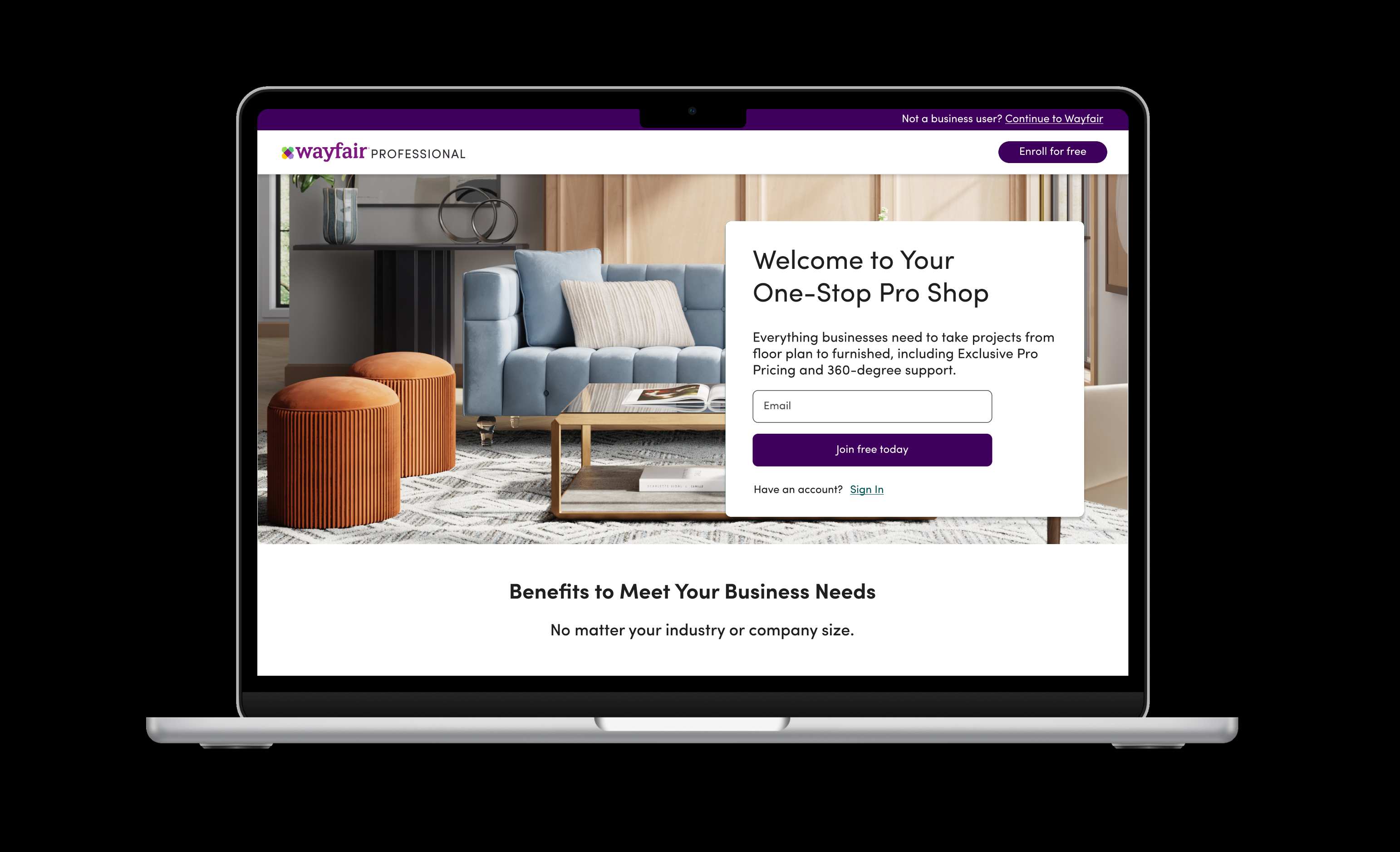
The hero component would summarize about Wayfair Professional and the offerings to business users. It needed a hero image, key messaging and a CTA with top three to four value offerings to engage the potential business customer.
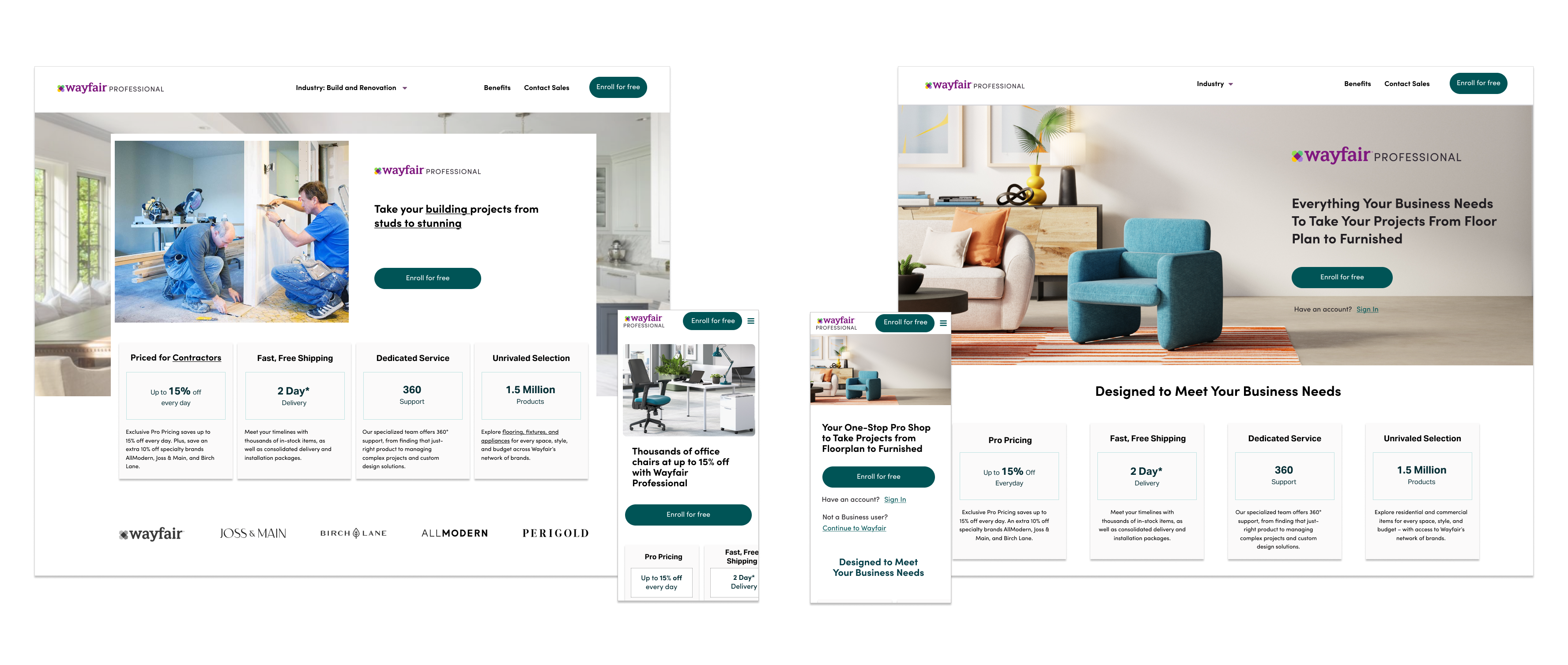
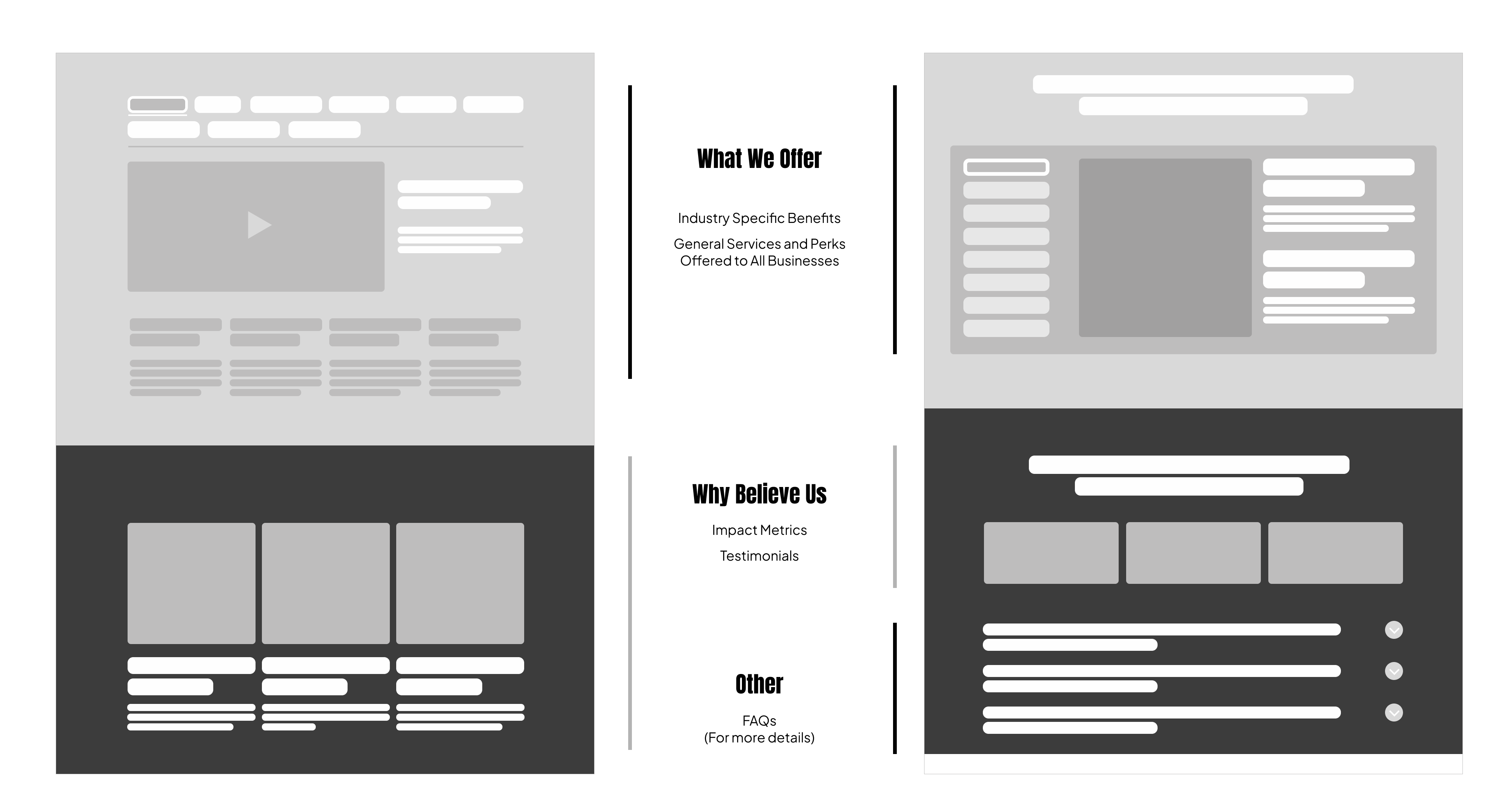
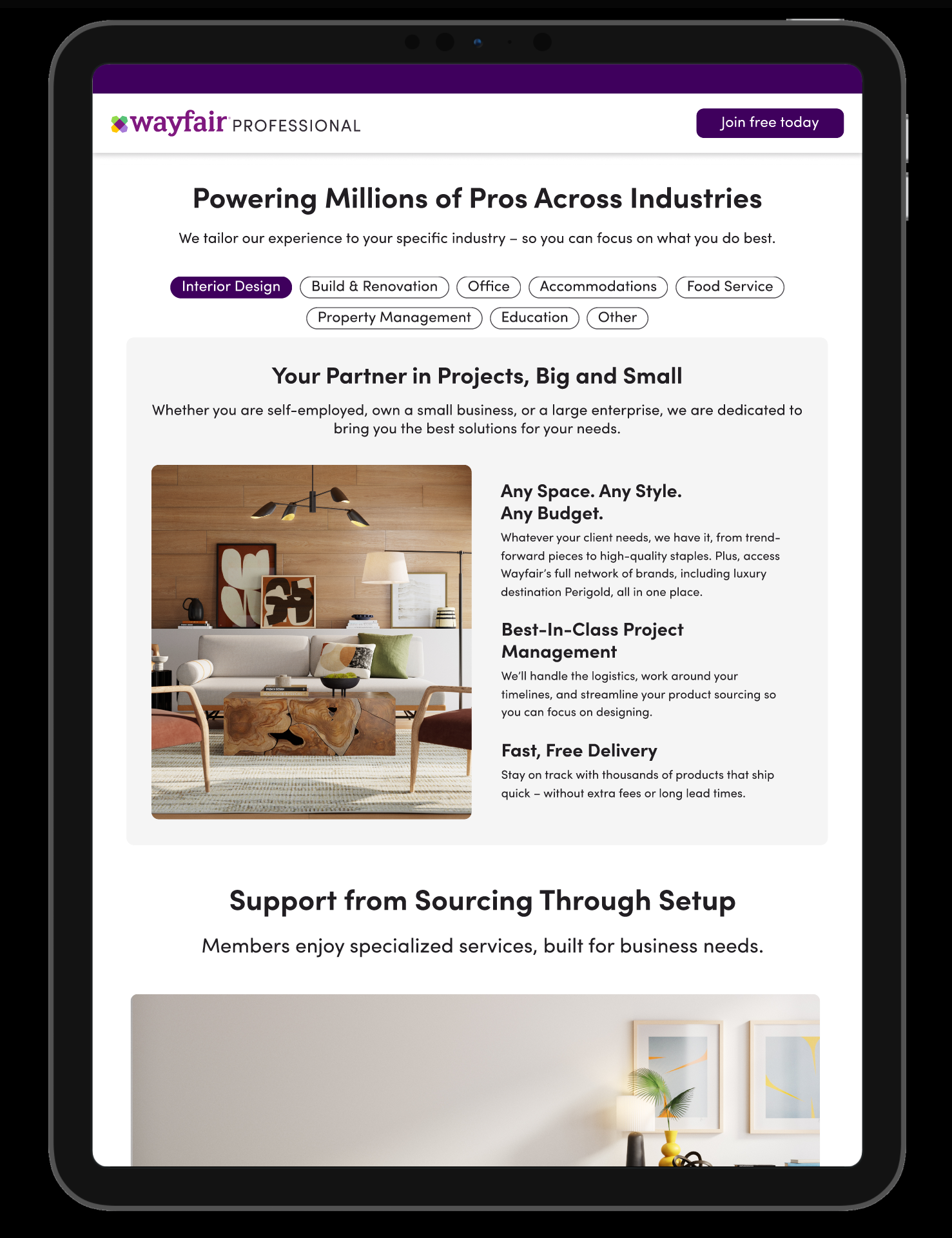
We needed a dedicated section for industry specific benefits such that the users could easily access what special benefits their business can avail with Wayfair Professional. The intent with these explorations was to allow users to see all industries at once and be able to explore the benefits offered.
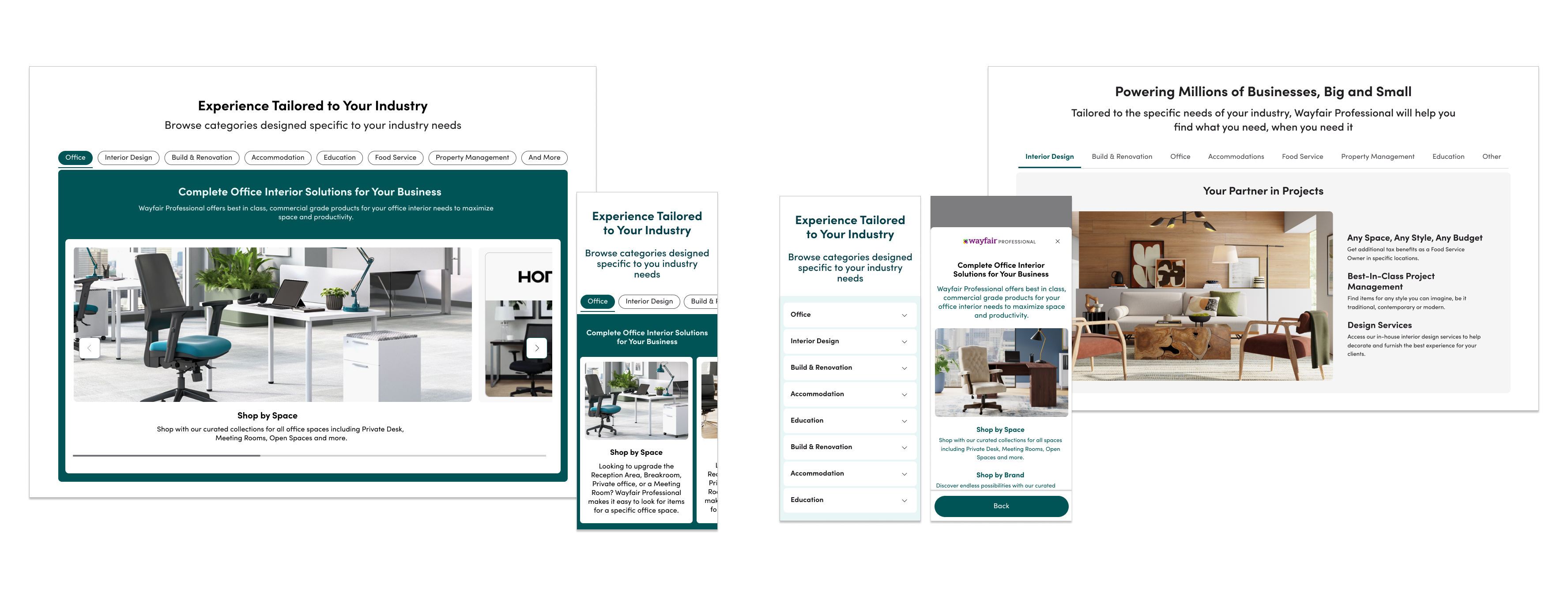
To learn the impact the new experience may have which included the messaging changes and the services offered we wanted to launch the experience while the engineering team built some complex components like the industry section.
Since there were a lot of content changes, I took to test with some users to gauge how the new communication of the benefits offered and the overall experience works.
I ran a usability test with 11 users each for mobile and desktop to learn if the users understand:
Users found the discount offering was good
and was clear and well laid.
Caters to all industries, has most services but free membership and Pro Discounts are the core drivers.
The learnings from the test suggested the changes are helpful in learning about the program benefits as a professional user which in turn will help with more enrollments. We made minor tweaks to the copy of certain sections and were ready to test the same in production.
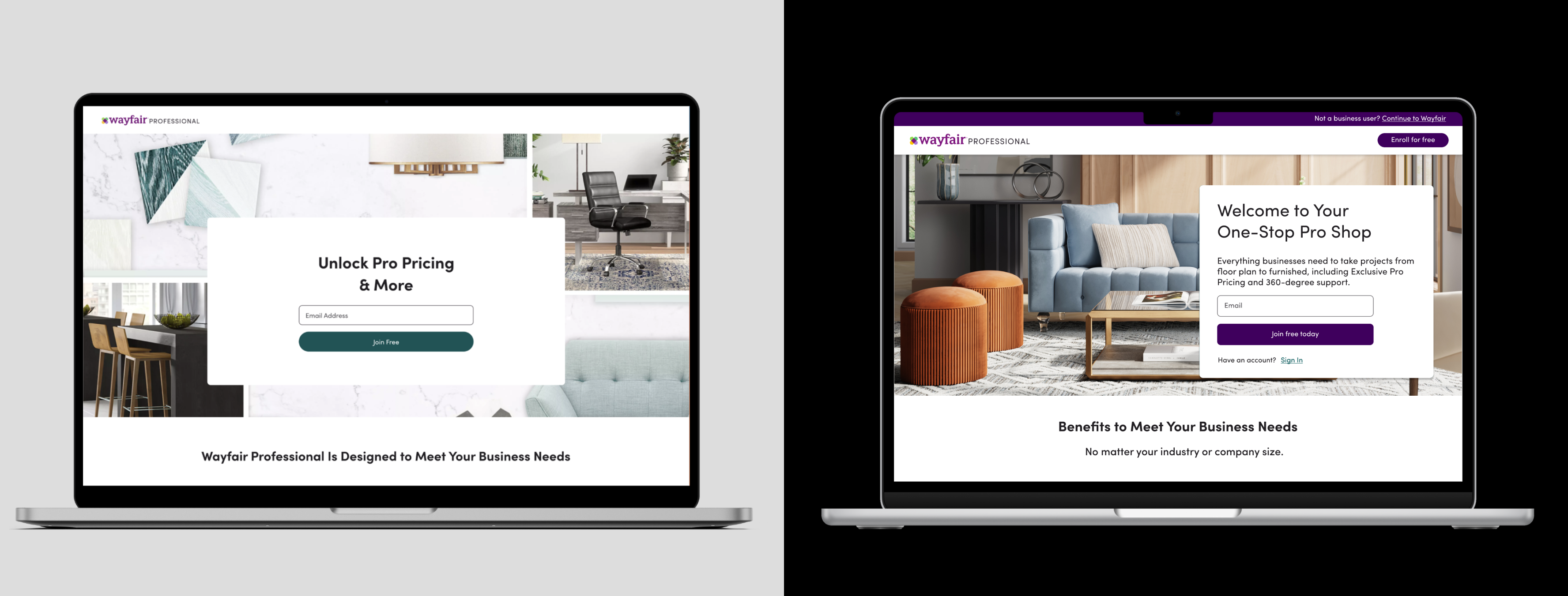
Since this was the new replatformed version of the experience being rolled out, we initially started with 5% enrollment and gradually increased to 10% and then to 50% after we were confident about the stability of the new system.
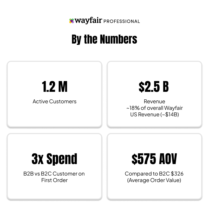
For us the success criteria would be the impact on enrollment rate and application completion rate. Given that earlier, most users would drop from application indicating to us the likelihood of non-business users accessing the enrollment. But with the new experience, we hypothesize that the business users are more intentional in initiating the enrollment application and thereby completing it. Following are the impact metrics at 50% launch:
Rate of successful enrollment on the same day of initiating the application.
Rate of successful enrollment within the 3rd day of initiating the application.
Enrollment Application Completion Rate. Post this, users are enrolled after verification.
With such significant results we planned to rollout the new experience to 100% of the users and deprecate the old components. We will plan towards further improvements in realizing the vision work like content for industry specific benefits, building the industry section component and testing the same in production would be ideal for the team.
With the new replatformed experience, the business team is now capable of running their own experiments in regards to minor changes such as copy change for hero section or CTA, or even imagery on the page. The sections can be reoriented ot the teams preference and tested over time.
Further ahead, we looked forward to collaborate with the content design team to help customize the entire experience based on the selected industry and test the same in production in future.
This project has been a comprehensive and enlightening journey for me. The success of this project is a testament to the power of user testing, iterative process and collaborative efforts.
As we move forward, the insights and methodologies developed during this project will serve as a foundation for future endeavors, ensuring that we continue to create exceptional user experiences.
Business verification using EIN (USA) was the most frictional step for users with 85% drops. By proving an easier path to alternate verification for businesses we increased enrollment by 36% and a reduction in drop rate by about 11%.
Conducted extensive usability tests, user research, and competitor reviews to deeply understand user expectations around the search experience when buying or looking for products of interest across millions of item inventory. Proposed key solutions aimed at enabling users to find the desired product or category more efficiently.
Improved the menu navigation experience to help customers efficiently find their desired category or product within an extensive assortment of 14 million products. By studying product taxonomy and conducting user research, enhanced the affordance of UI elements and optimized the overall menu structure across all product categories